The graph below is available online and shows the relationship between life expectancy and average individual income.

This graph instead of showing only the income vs expectancy data points also shows the geographical location (by the colour of the point) and the population (by the size of the point) of the country's datapoint.So its easy to see that Africa has low income and associated low life expectancy and also that some have much lower life expectancies than the rough trend line. Labeling the points is revealing, Southern African countries amonst are those that lie below the line while Muslem countries suxh as Comores and Senegal are 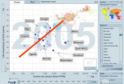
Then one is able to look at these points in time to see changes and even track the changes as a line connecting successive years 
or as a video
